

Appearance tab
Theme, colour schemes, custom colours, corner style, spacing, width and alignment.
Theme and scheme
- Theme (Free) — Light or Dark. Visitors always see the theme chosen here. There is no automatic mode and no switch on the site.
- Colour scheme — JoomClock (blue) is Free. (Pro): Ocean, Forest, Sunset, Monochrome and Custom. Preset schemes change the accent colour; neutral, holiday and feed colours stay the same.
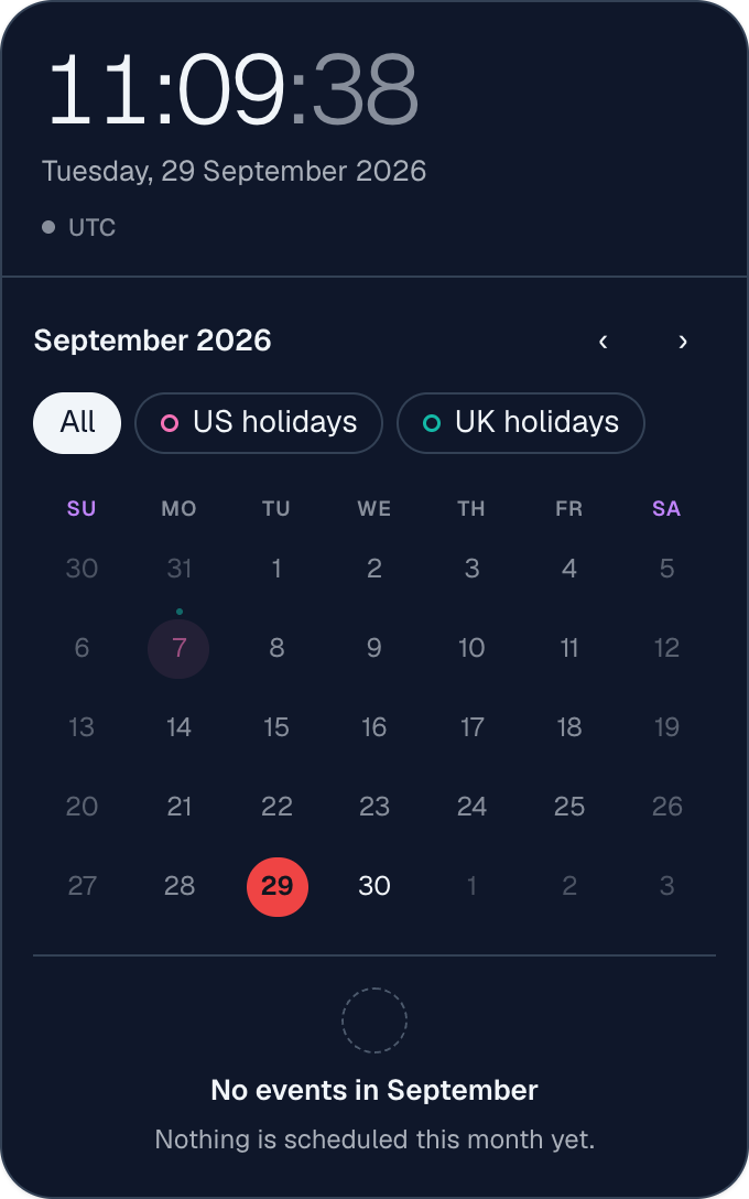
Custom colours (Pro, scheme "Custom")
Leave any colour empty to keep the theme's colour.
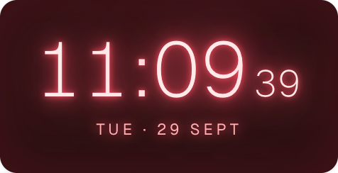
- Accent colour — buttons, links, the AM/PM badge and today's date. Neon, Glass and Gradient take their tint from it.
- Background — Theme, a custom colour, or Transparent to let the module blend into your template (tooltips and the event dialog stay opaque).
- Text colour, Secondary text colour (dates, labels; derived from the text colour when empty) and Border colour.
- With a calendar: Today highlight, Selected date, Weekend dates, Holidays.
- Character styles (Neon, Glass, LED, Retro Terminal, Gradient, Flip, Luxury, Sport Dark) keep their own designed colours.
| A dark custom scheme with a red today highlight (Pro) | Neon Glow tinted by a custom accent (Pro) |
|---|---|
 |
 |
Shape and spacing (Free)
- Corner radius — Sharp, Soft, Rounded, or Custom (0–40 px). Buttons, date cells and chips inside scale with it.
- Card shadow and Card border — show or hide them.
- Card padding — Compact, Normal or Roomy.
- Some options are hidden where they do not apply: a single-line clock on its own has no card; border and padding are hidden for styles that paint their own backdrop (Neon, Glass, LED, Retro Terminal, Gradient).
Size and alignment (Free)
- Module width — Auto (fills its position, or its natural size for a single clock), or Custom with a width in pixels (150–1600). It never grows wider than the position it sits in.
- Module alignment — Default, Left, Centre or Right: where the module sits when it is narrower than its position. It also aligns the top bar and footer lines. Combine it with a custom width to put a narrow module to one side or in the centre.
- Text alignment — Default, Left, Centre or Right for the time, date and label lines inside the clock. It does not apply to Progress Ring, the line clocks or Hero Card.
Analog clock parts (Pro)
For any analog style: face, border, marker, numeral, hand and centre-cap colours. For Analog Classic you can also change the marker shape, minute track, numerals (Arabic, Roman, quarters, none), hand shape, border width, second hand (with counterweight, or hidden) and cap size.
Other
- Show "Powered by JoomClock" (Free) — off by default.
- Module Class (Free) — extra CSS classes on the module, for template overrides.
- (Pro) Each calendar feed can also have a Custom colour (on the Calendar Feeds tab).