

The Advanced Tab
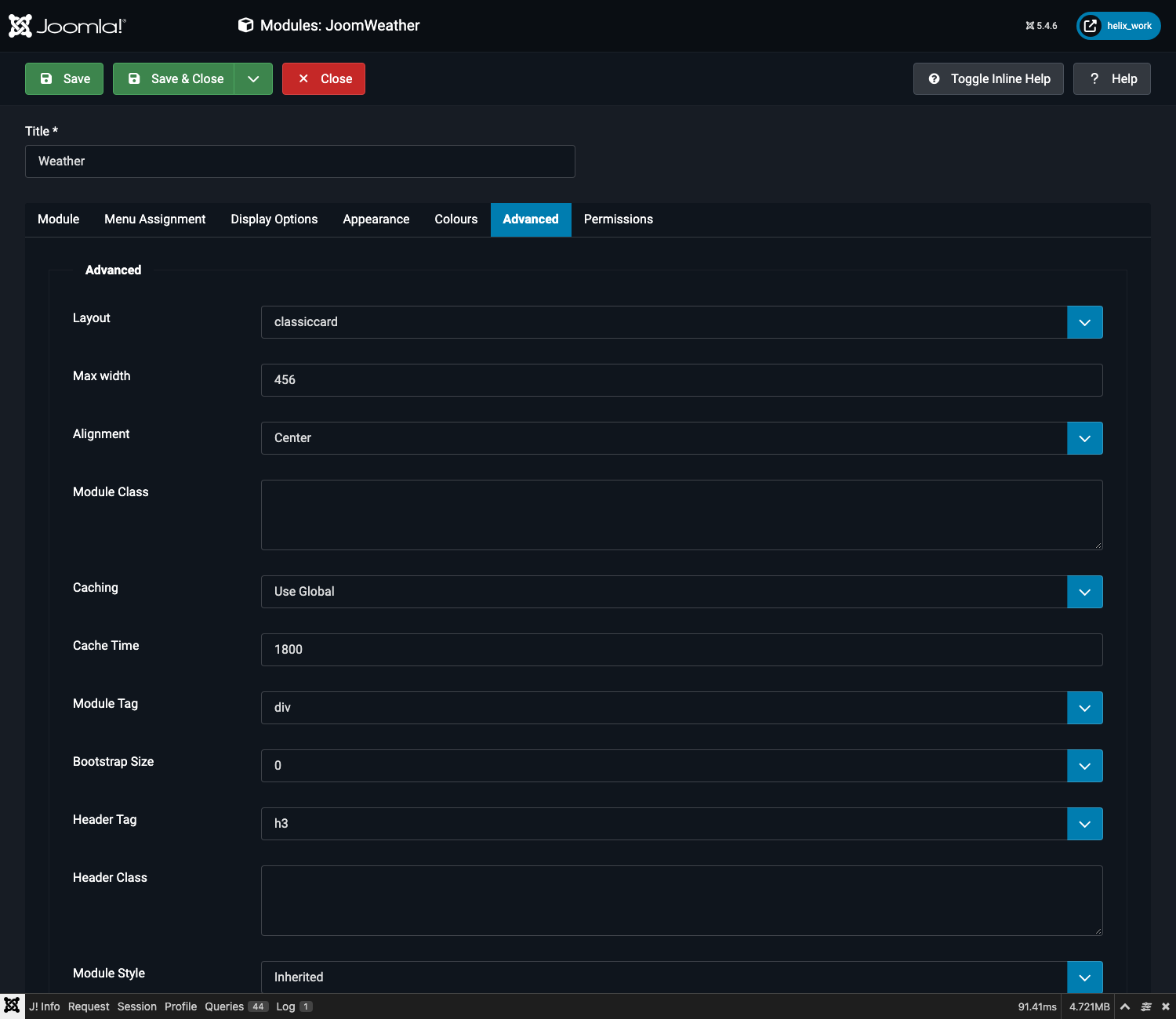
Layout selection, configurable max width, alignment and module class fields.
| Field | What it does |
|---|---|
| Layout | Chooses which of the 17 template files renders this module instance. See Layout Reference (All 17 Layouts) for the full list — the dropdown itself lists the raw filenames (e.g. classiccard, darkneon), not the friendly names used in this documentation. |
| Max width | Caps the module's width in pixels. Leave empty to use the selected layout's own default (each of the 17 layouts ships a sensible built-in width — see the table below). Enter 0 to remove the cap entirely and let the module fill the full width of its position — useful when a layout designed as a compact card is placed in a wide content column. Any other number overrides the layout's default with that exact pixel value. |
| Alignment | Left (default), Center, or Right — where the module sits within its position once it is narrower than the available space. Only visible once something makes the module narrower than its position: either a layout's own default width, or a Max width you've set. Has no effect on a module that already fills its position edge to edge — there's nothing to shift. |
| Module Class (labelled "Module Class Suffix" in older Joomla versions) | A CSS class suffix Joomla appends to the module's wrapping element, for template-level styling hooks. Rarely needed — every layout already carries its own scoped styling. |
Default widths per layout
These are the widths each layout uses when Max width is left empty — the same numbers the module has always used, now just overridable:
| Layout | Default max width |
|---|---|
| Classic Card, Illustrated / Playful | 420px |
| Gradient Sky, Glassmorphism, Forecast Timeline, Dark Neon | 440px |
| Minimal Sidebar | 280px |
| Dashboard Grid | 760px |
| Typography Focus | 460px |
| Card, Horizontal, Minimal, Detailed, Glass, Sleek, Horizontal Banner | No cap — already fills its container |
| Compact Nav | No cap — sized by its own content, not a card width |
Only two layouts — Card and Compact Nav — need a specific mention: Card (the module's original default layout) has never had a width cap, so setting Max width here is the only way to constrain it; Compact Nav sizes itself to its content (an icon, a temperature, maybe a dropdown) and is not designed as a card, so a Max width override there mainly matters for the menu-dropdown variant if you want its collapsed pill to stop stretching in a very wide header slot.
Alignment and the two layouts that flow inline
Minimal and Compact Nav are the two layouts designed to sit inline with surrounding content (a heading, a line of nav items) rather than stand alone as a block — by default they take up only as much width as their content needs and flow like a piece of text. Choosing Center or Right for either of them changes that: they switch to their own line and shrink-to-fit their content there, so the alignment has something visible to move. Left (the default) leaves them exactly as before — still flowing inline, unaffected.
The remaining fields on this tab (Module Tag, Bootstrap Size, Header Tag, Header Class, Module Style) are standard Joomla framework fields present on every module type in Joomla 4/5/6 — they control the HTML wrapper Joomla itself generates around the module, independent of JoomWeather. Joomla 3 does not show these.