
Layout Reference (All 17 Layouts)
Every layout with its friendly name, dropdown filename, and what it's built for, with screenshots.
The Layout dropdown (Advanced tab) lists every file in the module's tmpl/ folder, alphabetically, by filename. Below is every layout with its friendly name, the filename that appears in the dropdown, and what it's built for.
Design pack (11 layouts)
Each of these ships a light and dark palette pair and switches between them automatically — see The Colours Tab.
| Friendly name | Filename in dropdown | Best for |
|---|---|---|
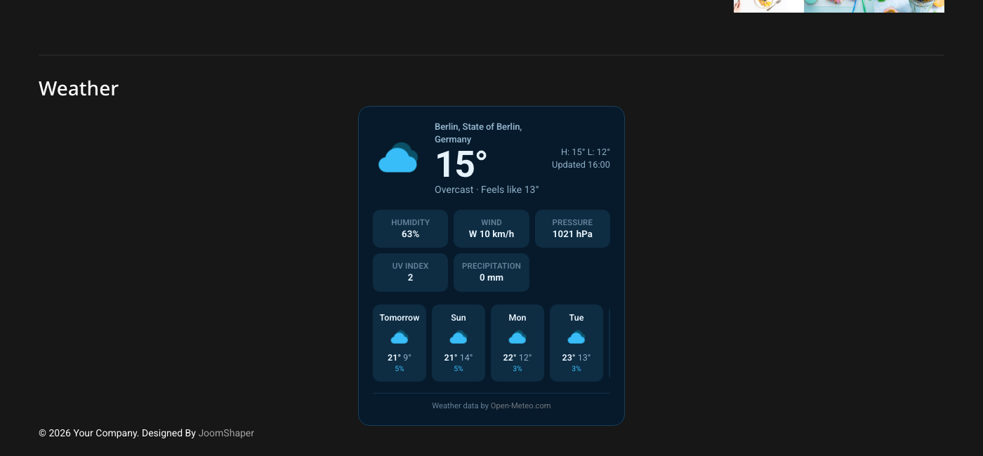
| Classic Card | classiccard |
Sidebar or content column. Icon, temperature and a summary column over a grid of stat tiles and a scrolling forecast strip. |
| Gradient Sky | gradientsky |
Header or full-width hero. Warm-to-cool gradient panel, white type, frosted forecast chips. |
| Minimal Sidebar | minimalsidebar |
280px sidebar columns. One summary line plus a compact vertical forecast. |
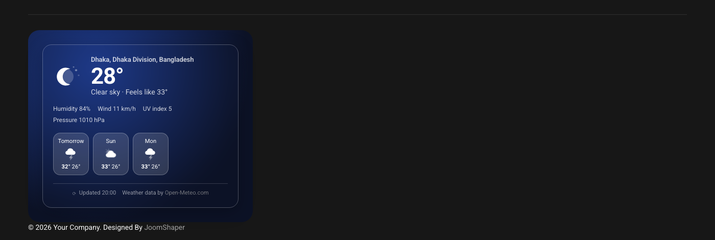
| Glassmorphism | glassmorphism |
Featured content widget. Frosted panel floating on a radial gradient ground, legible anywhere. |
| Dashboard Grid | dashboardgrid |
Wide content column. Current conditions beside a tile grid of every reading, forecast as a real table. |
| Horizontal Banner | banner |
Header or footer bars. Single full-width strip with an inline forecast. |
| Forecast Timeline | timeline |
Dedicated weather block. Each day is a bar spanning its low to its high, scaled across the whole forecast. |
| Dark Neon | darkneon |
Dark footers and sidebars. Terminal-styled card with a glowing icon and monospace readouts. Always dark — ignores the Colours tab's light/dark switching. |
| Illustrated / Playful | playful |
Lifestyle and travel sites. Big bobbing icon in a circular scene, soft pills and rounded day cards. |
| Typography Focus | typography |
Editorial homepages. Oversized serif temperature, italic condition line, quiet forecast table. |
| Compact Nav | compactnav |
Menu bars and header strips. Four sub-variants, chosen on the Appearance tab — see below. |
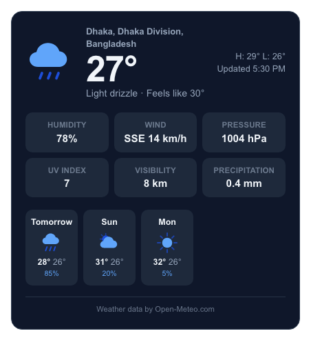
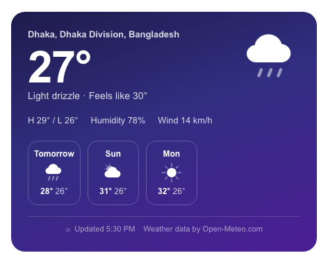
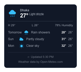
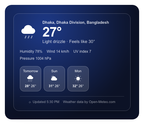
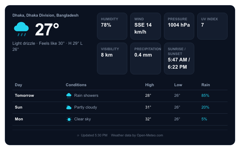

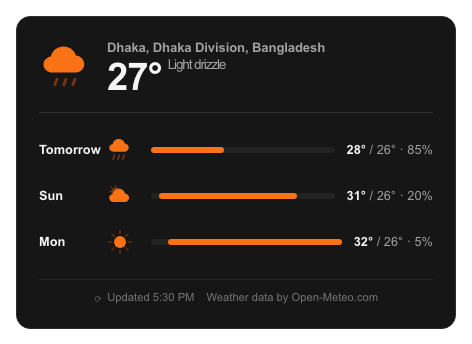
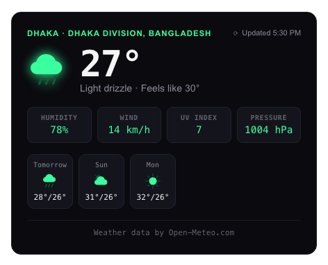
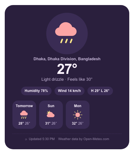
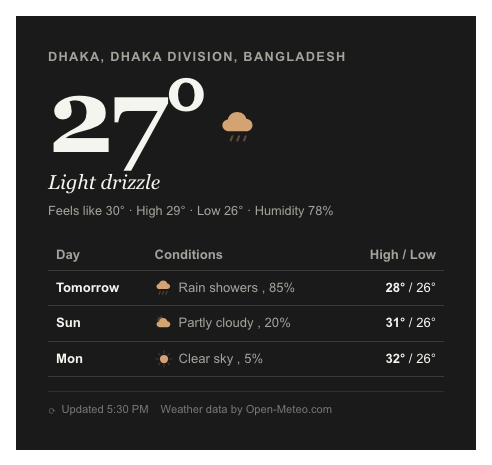
All ten renders above use the same sample data (Dhaka, light drizzle, 27°C) so the layouts are directly comparable — colours and content are the design pack's own defaults, with no Colours-tab customisation applied.
Compact Nav variants
Chosen with the Compact nav variant field on the Appearance tab (see The Appearance Tab); only relevant when Layout is compactnav.
| Variant | Shows |
|---|---|
| Menu dropdown | A pill with location, temperature and condition that expands to the forecast on click. Built on a native HTML <details> element — works with no JavaScript, and is fully keyboard-operable. |
| Icon and temperature | Just the icon and the current temperature — the smallest footprint. |
| Badge (details on hover) | A small pill that reveals a background highlight on hover/focus; full conditions appear in a tooltip. |
| Text strip | Icon, temperature and condition text on a single line. |
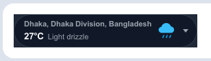



In its intended placement — a real header/menu-bar position, not an isolated card — the Menu dropdown variant looks like this:

Original layouts (6 layouts)
| Friendly name | Filename in dropdown | Best for |
|---|---|---|
| Card (the module's original default) | default |
Sidebars / footers. Gradient background that changes colour with current conditions (toggle: Colours tab → Tint by weather condition). |
| Horizontal | horizontal |
Header banners. One-row strip with pill-shaped stats and a compact multi-day strip. |
| Minimal | minimal |
Hero sections / top bars. A single inline line that inherits the surrounding template's text colour rather than bringing its own. |
| Detailed | detailed |
Sidebar weather panel with stat tiles and a vertical daily list. |
| Glass | glass |
Frosted-glass card with backdrop blur — designed to sit on top of a photo or colourful section. |
| Sleek | sleek |
Dark, app-style card with a glowing icon and forecast rows. |
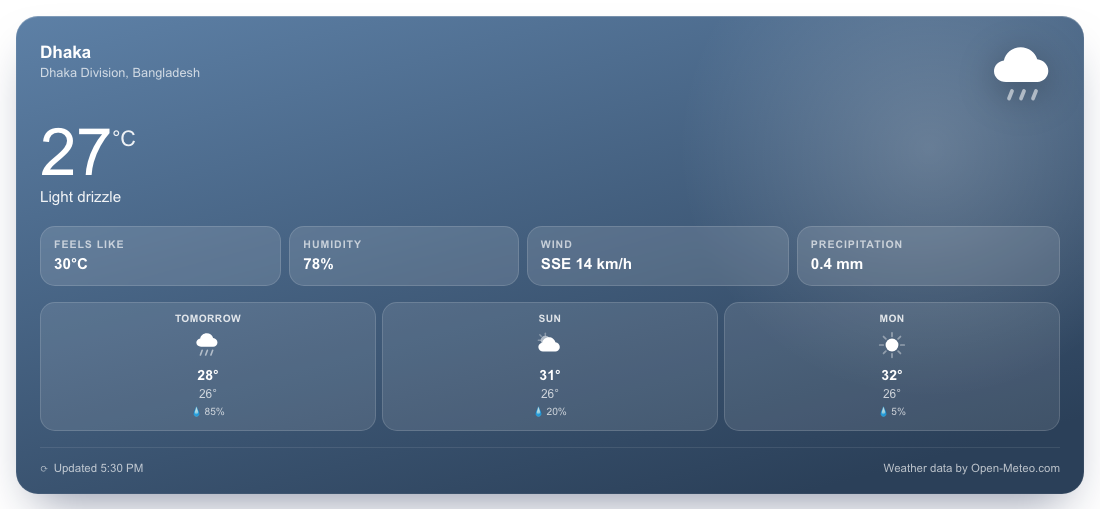


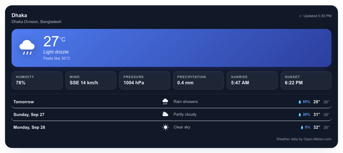
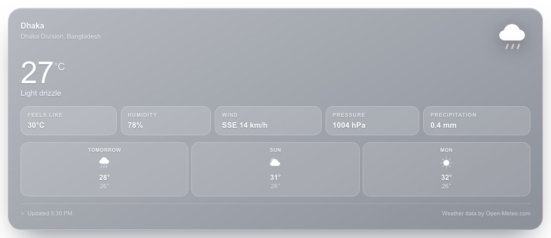
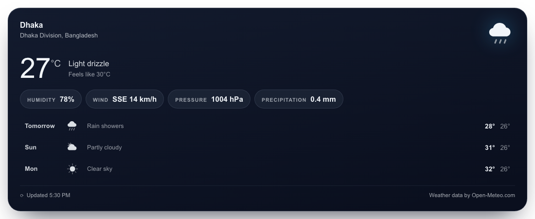
Two of these — Card and Glassmorphism — also appear rendered live on a real frontend page, with a custom colour scheme and forecast data (rather than the static preview data used above):