
Icon Styles
The five icon paint styles and the 13 supported weather conditions.
Chosen once per module instance, on the Appearance tab, and applied to every icon that instance renders (current-conditions icon and every forecast-day icon).
| Style | Look |
|---|---|
| Duotone (default) | Primary shape filled solid, secondary details (sun rays, raindrops) in a lighter accent tone. |
| Line | Hollow outline only, drawn in a single stroke weight, no fill. |
| Filled line | Outlined shapes with a flat secondary-colour fill — a middle ground between Duotone and Line. |
| Mono solid | One solid colour throughout; inherits the surrounding text colour on the six original layouts. |
| Full colour | A fixed, naturalistic palette per condition (yellow sun, blue rain, grey cloud) independent of the module's Accent colours. |
All 13 conditions in each of the 5 styles, rendered by the same preview script referenced in Layout Reference (All 17 Layouts):
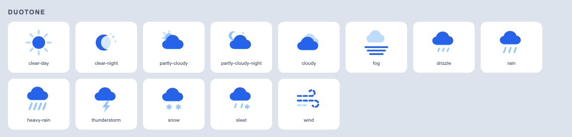
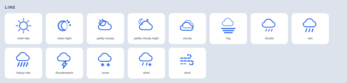
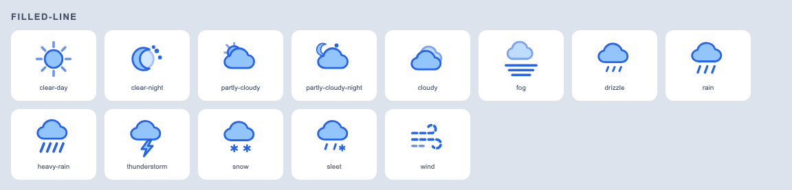
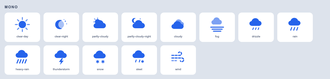
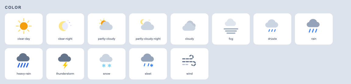
Every icon is inline SVG (no icon font, no sprite sheet, no extra HTTP request) and supports 13 conditions: clear day, clear night, partly cloudy (day/night), cloudy, fog, drizzle, rain, heavy rain, thunderstorm, snow, sleet, and wind.