

The Colours Tab
Built-in colour schemes, custom colour pickers and the gradient editor.
This is the most powerful tab in the module: it can restyle every layout, not just the ones from the design pack.
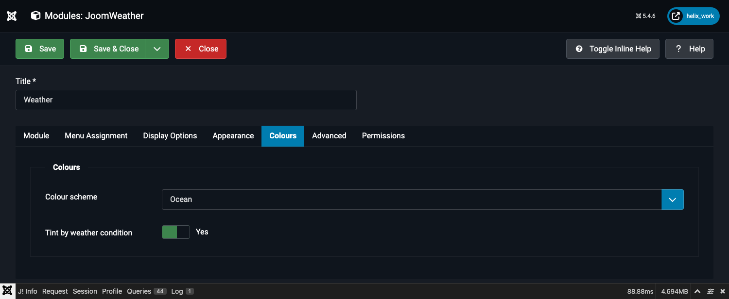
Colour scheme
A dropdown with these options:
| Value | Behaviour |
|---|---|
| Design default | Every layout uses its own built-in colours, unmodified. This is the out-of-the-box look. |
| Ocean | A blue/teal palette with matching light and dark variants. |
| Sunset | Orange/pink. |
| Forest | Green. |
| Rose | Pink/red. |
| Slate | Neutral grey. |
| Custom colours | Reveals a full set of colour pickers, described below. |
The five built-in schemes (Ocean, Sunset, Forest, Rose, Slate) each carry a matched light and dark pair and switch between them automatically based on the visitor's operating-system colour-scheme preference (prefers-color-scheme) — there is no separate light/dark setting to manage.
Tint by weather condition
A Yes/No switch, on by default. Only affects the Card layout (Advanced tab → Layout → default), which by design recolours its background to match the current conditions — blue for clear skies, grey for rain, purple for thunderstorms, and a darker palette at night. Switch this off to hold one fixed colour on that layout regardless of the weather; the gradient colours described next then take over.
Custom colours
Visible only when Colour scheme is set to Custom colours.
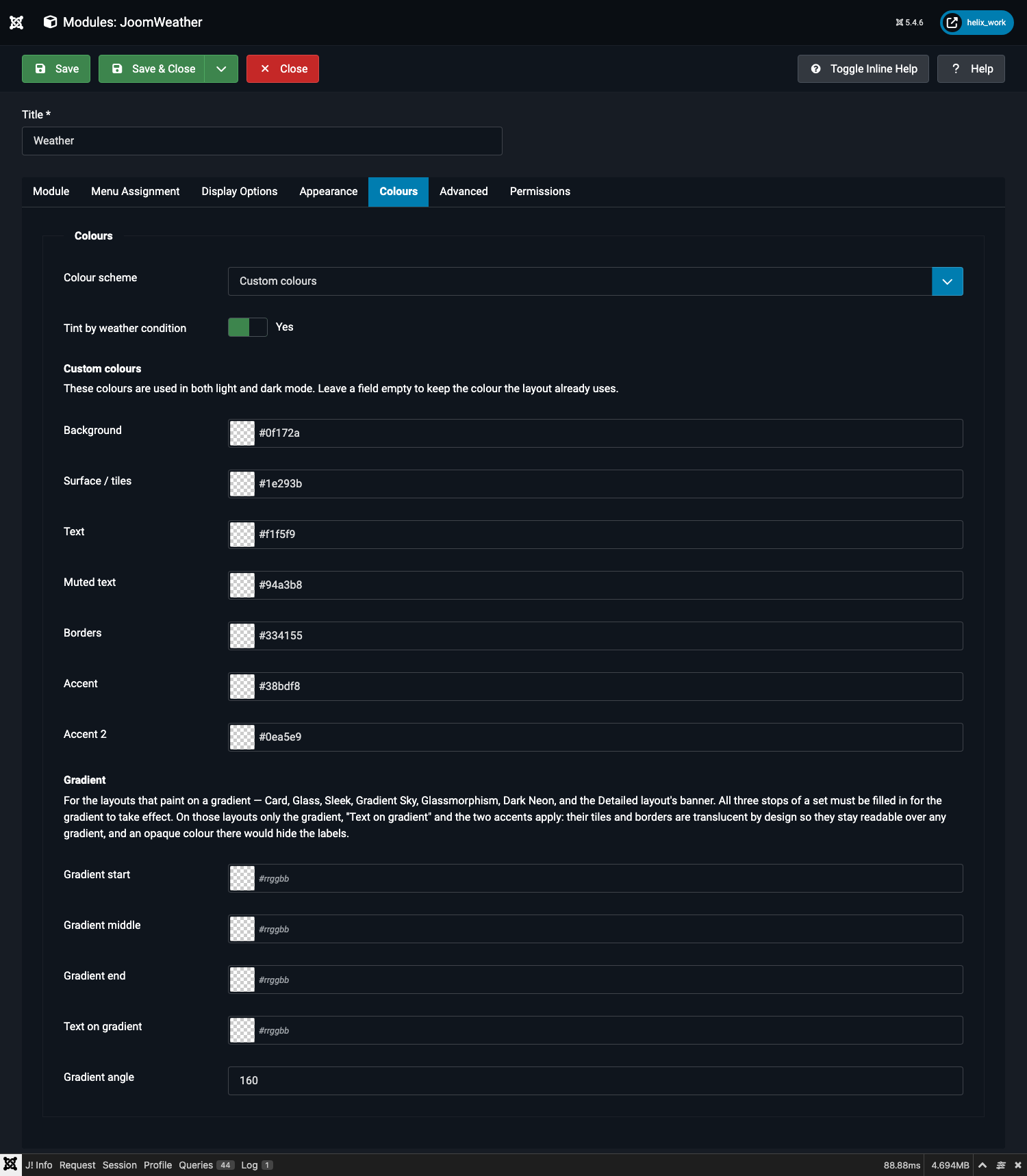
Each field is a colour-swatch picker (click the swatch to open a picker, or type a hex value directly) with a #rrggbb placeholder. Leave a field empty to keep the colour the layout already uses — you don't have to fill in all seven to change just one.
| Field | Drives |
|---|---|
| Background | The card or panel background, on the layouts with a flat (non-gradient) surface. |
| Surface / tiles | Stat tiles, chips, and individual forecast cells. |
| Text | Headings, the main temperature reading, and stat values. |
| Muted text | Labels and secondary text — units, the "updated" line, day names. |
| Borders | Tile borders and separator rules. |
| Accent | Icon colour, temperature-range bars, rain-chance percentages, focus outlines. |
| Accent 2 | The secondary tone in duotone and filled-line icon styles. |
One set of colours applies in both light and dark mode. There is no separate dark-mode picker for custom colours — if you need different colours per mode, either use one of the five built-in schemes (which do carry a light/dark pair) or add a manual CSS override (see Colour Customisation, in Depth).
Gradient
Also only visible when Colour scheme is Custom colours. A subset of layouts paint on a gradient rather than a flat surface — Card, Glass, Sleek, Gradient Sky, Glassmorphism, Dark Neon, and the Detailed layout's banner strip. These five fields control that gradient:
| Field | What it does |
|---|---|
| Gradient start | First colour stop. |
| Gradient middle | Middle colour stop, at 45% along the gradient. |
| Gradient end | Final colour stop. |
| Text on gradient | The text colour used only on the gradient-painted layouts — kept separate from the flat Text field above because gradient layouts need light text on a dark ground, which would be wrong on the flat layouts. |
| Gradient angle | 0–360°. 160 (the default) runs top-left to bottom-right; 90 runs left to right; 180 runs straight down. |
All three colour stops must be filled in for the gradient to take effect. If you set only "Gradient start", the layout falls back to its own default gradient rather than rendering something half-applied.
On the gradient-painted layouts, only the gradient, Text on gradient, and the two Accent colours apply — the flat Background, Surface, Text, Muted text and Borders pickers are deliberately ignored there, because those layouts' tiles and borders are translucent overlays designed to stay legible over any gradient; forcing an opaque colour onto them would hide the text sitting on top.